


A lot goes into designing beautiful html email templates, landing pages, web pages, but if we have to choose a ‘make or break’ element, it is the banners. They hook the reader’s attention in the first few moments. In fact, an average person takes the call in 50 milliseconds on whether they are going to stay on a website or not.
But, there is no standardization for banner design, and marketers are left on their own when it comes to designing these images. Brands also prefer embedding CTAs on the banners alongside the text and images. If you are wondering how to design winning banners that will help promote your brand and increase conversions, you are at the right place. Today, I will share banner design insights gathered throughout my extensive career. Buckle to explore banner design hacks.
Use AIDA Model For Placing Various Elements Within Your Banner
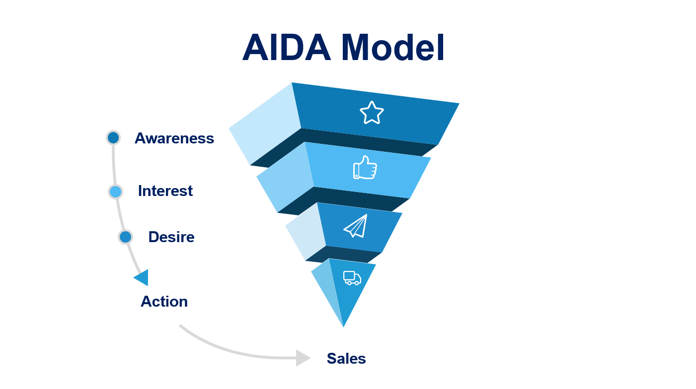
Since there is no absolute standard available for comparing banner design, I recommend going with the marketing funnel basics- the AIDA model. It allows setting your priorities and establishing relations between various banner elements. You don’t always need to use all components (image, copy, and CTA), but the banner should demand the reader’s attention/awareness, spark interest, and convert their desire into action.
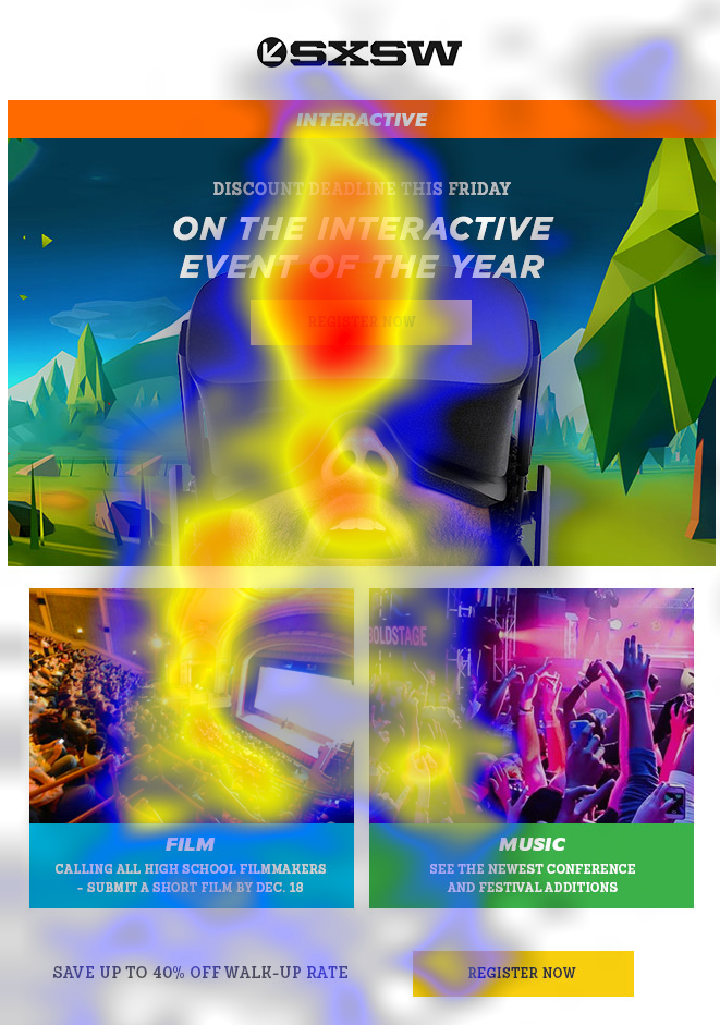
You can use an inverted triangle, F-pattern, or Z-pattern but be sure to place the CTA within close proximity of the image/text. Using product images and copy (text) directs the user’s attention. The promotional offer/link to the resource creates a desire to click on the CTA button. Thus, depending on the purpose of sending the email, you can select and place these elements. Here’s a heat map showing the importance of visual hierarchy in banners:
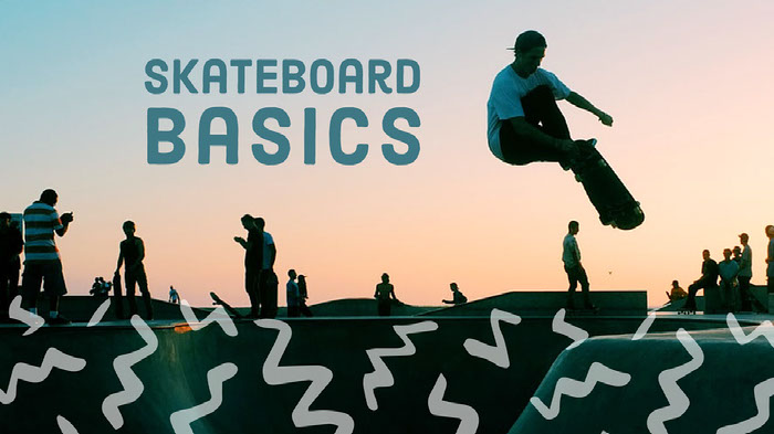
Your Banner Image Should Help Visualize What Your Message Is About
When a reader sees your banner, they won’t be looking to pay attention in most cases. If it’s on a Google display ad or on a blog, you will have to catch their attention and convey your purpose almost instantly. Your banner image is the first thing they would look at since reading copies consumes significantly more time than glancing at images. With this being said, they won’t look for perfection narrowed down to pixel level, but they will look if the concerned topic is worth clicking.
Thus, the image plays the most important role in your banner: helping recipients visualize your content’s purpose. Go for graphics that make it easy for the user to visualize why and how you are going to serve their needs. The formula cuts the efforts, time required to understand and showcases the result like in the below example:
Complement Reader Intent When Using CTA Within Banner
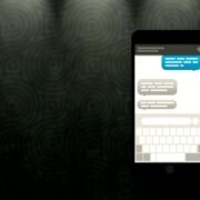
When using a CTA button, you will need more than just eye-catching designs: complementing reader intent. The most effective way of doing so is to use ad copy around your CTA button to clarify what benefits/solutions the user can expect from clicking on it. You can also use social proof or statistics instead of highlighting your product features, provided that the banner remains self-explanatory.
If the reader has to put in too much effort, the chances are that they will not reach your CTA button. But, giving them a solid reason in the banner to click the CTA button and keeping it right next to it helps increase the click-through rate. This tactic helps make conversion smoother, as shown in the below example:

Use The Rules Applied For Copywriting To Create Banner Text
Copywriting becomes as important as graphic design for creating banners since the user is going to make their decision based on what they are going to get out of it. Also, there won’t be enough space for packing too much information, as discussed earlier. Thus, it is best to go with the copywriting basics to make your banner as attractive as possible.
Using power words, connecting with the emotions, engaging the user’s imagination skills are necessary to throttle their attention. Keep your banner copy short, objective, and try to explore the benefits in multiple layers like in the below example:
Be Creative With Your Illustrations
Illustrating your point is a good idea, but you will need to be creative with it. A lot of designers overcomplicate the whole message by describing too much information at once or by simply making it unrelatable for the reader. Remember, your customers aren’t going to be as enthusiastic about your products as you, so try keeping it simple and creative.
Zoom in whenever you are trying to get creative with details. Here, Starbucks has displayed the basic elements of their new offering, which makes it creative and attractive at the same time:
Summing Up
A winning banner addresses the masses, and yet it feels relatable to them at the individual level. It should be simple, impressive, and drive the reader’s attention as a knife would move through butter. Also, do not pay too much attention to one of the aspects of your banners. Treat them as billboards with CTA buttons for displaying your brand: A good mix of copy, graphics, and relevance to the platform where it’s positioned. Keep this thing in mind, along with the tips mentioned above, for creating winning banners that promote your brand flawlessly.

